
Brand Identity System
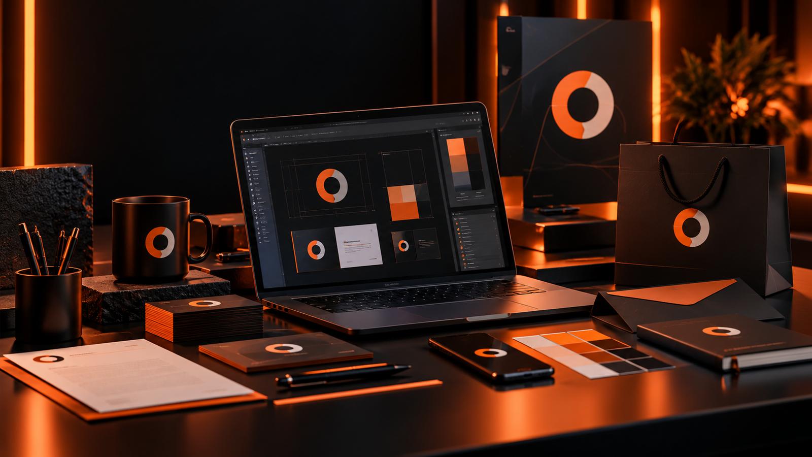
Built around the business problem.
The brief was not simply to create a new logo. The business needed a visual system that could make every customer touchpoint feel related, professional and recognisable while remaining flexible enough for future campaigns and new services.
What needed to change.
The existing brand relied on different fonts, colours and layouts depending on who created the asset. Social graphics did not feel connected to printed material, documents looked unrelated to the website and the logo had no clear rules for scale, spacing or alternative applications. This inconsistency weakened recognition even when individual pieces looked acceptable on their own.
Strategy before decoration.
We defined the brand around a small number of repeatable decisions: a clear logo structure, controlled colour palette, typography hierarchy, graphic shapes, image treatment and spacing rules. Every design decision was tested across practical items rather than approved only on a presentation slide.
Designed to work, not just look good.
The identity system includes primary and secondary logo applications, colour specifications, typography, social templates, stationery, business cards, presentation styling and reusable graphic devices. The system is intentionally simple enough for everyday use while giving designers enough flexibility to create new campaign work without losing consistency.
Clearer journeys. Better touchpoints.
Customers encounter the same visual cues whether they open a proposal, visit the website, receive a business card or see a social post. That repetition makes the business easier to recognise and gives even routine communication a more deliberate, established feel.
Work that moves the business forward.
The business gains a practical brand toolkit rather than a collection of isolated design files. New material can be produced faster, brand decisions are easier to maintain and the overall customer-facing presence feels more coherent.